
I have a fascination with fishmonger counters, the rhythm of shapes, colours and textures are beautiful, reminding me of Busby Berkeley choreography. They are also places where I can get up close to different species of fish and observe their anatomy.
My experience of eating herring has always been as kippers with their bronzed smokey colours, so it was interesting to see the brightness of their scales contrasting with the warm pinks, oranges and golds of their heads.

Sketch of Whitstable coast line
The initial idea for the composition of this painting came from a quick drawing of Whitstable seen from the Isle of Sheppey. It reminded me of crinkly paper edges and got me thinking about shadows created by paper.

Charcoal sketch of herring
Often the subjects I paint have a lot of space around them, sometimes with shadows to give them a sense of being on a surface. With this piece I wanted to explore the paper going out of frame and create a shallow depth of field with a simple shadow.
The fish are placed top to tail with the softness of their bellies just touching. The darker colours of their backs and bright highlights complimented the vertical line of the shadow cast by the paper’s edge.

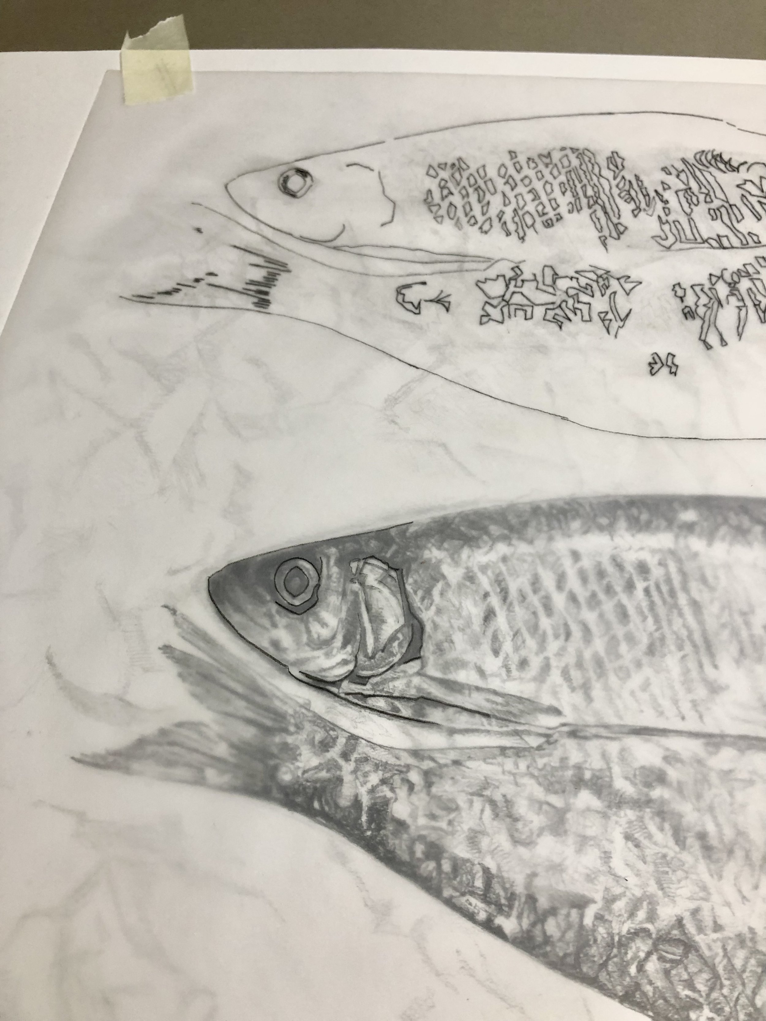
Herring - pencil drawing
I draw very differently with charcoal to pencil, there is an immediacy and it stops me from focusing on detail. I like its forgiving nature and find it easier to test out ideas and compositions as you can wipe or lift them away.
With pencil drawings, it’s very different, they are more detailed as I’m looking at recording tone, lines and form that can be translated into a painting - although I did try to create looser marks to describe their shimmer rather than the net like patterns I could see.

Printing the outline of the herring with drawing ink and tracing paper.
Tracing areas of tone from the preparatory drawing to transfer onto the painting.
Beginning with the lightest tones I built up layers of watercolour. I wet the paper and drop in pale washes of yellow before tracing areas from the original drawing and gradually working light to dark. There were a few times I lost my way with this piece as it was difficult to not over work the bright areas of the fish. It helped to write notes and keep track of my thoughts, especially when waiting for sections to dry.

Initial pale washes of watercolour.

Gradually building up stronger tones.

Printing drawing ink over watercolour paint.
Adding texture to describe the scales on the herring using the blotted line technique.

Adding darker washes.

Completed painting.
It has been interesting exploring composition and using a background that goes out of frame. The creases of the paper and the vertical lines created from the colours of the fish and shadow cast by the edge of the paper work in harmony and I am looking forward to seeing what it looks like framed.

Silver Darlings - Signed giclee prints are available on A3 Hahnemuhle Bamboo paper
Click on image for details
More of my seafood paintings including, Mackerel, Kippers for Tea and Top to Tail can be viewed here.

